 IST,
IST,


Food Inflation: This Time it's Different*
Dr. Subir Gokarn, Deputy Governor, Reserve Bank of India
delivered-on డిసెం 13, 2011
|
1. I would like to thank Prof. Parchure for inviting me to deliver this year’s Kale Memorial Lecture. The lecture has been instituted to honour Rao Saheb R. R. Kale, who was instrumental in setting up this great institution, the Gokhale Institute of Economics and Politics. Despite his professional achievements as a lawyer, he was apparently a rather modest and humble person. Given his financial contribution to the establishment of the institution, it would have seemed perfectly appropriate for it to have been named after him. But, he demurred and it was named after Gopalkrishna Gokhale, a somewhat more recognizable name for readers of Indian history. While Rao Saheb Kale’s name may not adorn the institution, the attributes that he is given credit for are the foundations for any activity to be sustainable and effective. I feel very honoured and privileged to be delivering this lecture in his memory. 2. I am also very pleased to be speaking at the Gokhale Institute itself. Many of my colleagues over the years are alumni of the Institute and I always enjoyed my interactions and collaborations with them and appreciated and valued their understanding and insights. Besides, the Institute has a Reserve Bank of India Chair, which we are very glad to have Prof. Parchure occupying at a time when we are strategically increasing our level of engagement and two-way knowledge transfer with the Chair Professors across the country. 3. Turning to the topic of today’s lecture, the title is admittedly borrowed from a recent book, the very influential historical work on financial crisis by Carmen Reinhart and Kenneth Rogoff1. Besides being a very catchy title, which is always very tempting to borrow, I felt that there was some similarity between the historical dynamic described in the book and the situation we are facing with food inflation in India today. Crises recur because there are just enough differences between the circumstances that cause them for people to be able to deny their inevitability. However, the underlying drivers of virtually every crisis are essentially similar. In the story of financial crises that the book tells, unsustainable build-ups of exposures, underestimation of risks and an erosion or inadequacy of regulatory capacity are the common elements of all crises. 4. When I joined the RBI, food inflation had been a headline issue for almost two years, beginning late 2007 and consolidating very sharply in the first half of 2008. There was definitely a global dimension to this during that period, but what was striking was that even after global food inflation moderated, Indian food inflation persisted. The weak monsoon of 2009 was, of course, blamed and we all believed that softening was only one good monsoon away. Well, 2010 was a good monsoon but, as it turned out, there was little respite in food inflation. Let’s wait for 2011, we thought. 2011 was also a relatively good monsoon year, but in the immediate aftermath of the monsoon, there wasn’t much respite. Fortunately for policymakers, data from recent weeks suggests a softening in food inflation, but the level is still rather high. 5. During the two years I have been with the RBI, persistent food inflation has been one of the critical challenges to monetary policy formulation. There is a view, entirely legitimate, that monetary policy has no role in dealing with food inflation. Policy actions should, instead, be triggered by some measure of core inflation. However, this argument weakens somewhat when we move from a scenario where food inflation episodes are transitory, or short-lived, to one in which they are persistent, as has been the case in recent years. In the face of persistent food inflation, just as with any persistent supply shock, the appropriate response is seen to be to use monetary policy to prevent the spill-over from the shock into more broad-based or generalized inflationary pressures. In other words, in order to keep inflation under check, relative prices across categories of commodities have to change in favour of the ones facing the supply shock. 6. I want to get away from the monetary policy perspective for now and focus on the issue of relative prices. When we bring these into the discussion, we immediately enter the realm of microeconomics, i.e., the basic forces of demand and supply. From this perspective, the simple question “why are food prices rising so persistently” gets a simple answer “because demand persistently exceeds supply”. The next simple question “how do we bring food inflation down?” again gets the simple answer “by increasing supply as quickly as possible”. 7. In the context of the title of my address, let me emphasize the point that the food inflation per se is not a new phenomenon for India. On Slide 1, beginning in the early 1950s, we can see a relatively large number of episodes in which food prices spiked. In some of these episodes, the spikes were significantly sharper than in others and many of them, particularly during the more recent decades, were relatively short-lived. Of course, the most vivid ones were the two that followed closely in the late 1960s and the early 1970s. We have apparently had nothing comparable since then in terms of the peak rates of inflation. In the most recent episode, however, the pattern is somewhat different; there is a clear indication of a prolonged upward trend beginning sometime in 2003 and showing persistence, albeit with a brief interruption. 8. This is, of course, very noisy data. We have tried to systematize it to be able to draw some more substantial inferences. In Slide 2, specific episodes during the six decades have been identified on the criterion that the average food inflation rate during each episode was 10 per cent or higher. The slide displays the average and peak rates during these episodes. The episodes during the late 1960s and early 1970s clearly stand out, while the more recent episodes are relatively more moderate in terms of both average and peak rates. However, the most recent episode does suggest something of a hardening. 9. But, this is as far as magnitudes go. A more worrying attribute of food inflation is persistence. Slide 3 displays an extremely significant pattern, which is really the foundation for the title of this lecture. We had two episodes of high persistence in the early 1970s and the late1970s-early 1980s, during which food inflation was on the average above the 10 per cent mark for 35 months and 32 months, respectively. Since then, as the graph clearly indicates, episodes were relatively short-lived, with the longest one lasting 27 months in the early 1990s. Even in the severe drought conditions of 1987, the high food inflation episode lasted only 18 months. But, strikingly, the most recent one, which runs from September 2008 until October 2011, was 38 months long and, in a sense, still running. Further, if we are to overlook the brief interruption that was visible in Slide 1, the last two episodes could be counted as one even more prolonged stretch. 10. Is this kind of persistence a return to the conditions that prevailed before the 1980s? Are we now entering a phase in our economic development in which food supply constraints can once again threaten growth and macroeconomic stability? To answer these questions, we need to look at what drove food inflation in the past and whether the same forces are at work now. 11. We try to do this in the next three slides. All three graphs provide, for different periods, the contribution of different categories of food items to overall food inflation. Slide 4 shows the picture for the 1960s and 1970s, Slide 5 for the 1980s and 1990s and Slide 6 for the first decade of the 2000s. A number of important inferences can be drawn from this historical comparison. In the 1960s and 1970s, as seen in Slide 4, the main contributions to food inflation in the years that have been selected for display came from cereals and sugar. In the graph for the three-year period 1972-1975, which was one of the prolonged episodes that were identified in the earlier discussion, what is striking is that these two categories vied with each other to drive food inflation. While sugar was the dominant contributor in the first year, cereals took on that role in the next two years. Between the two, they accounted for a very high proportion of total food inflation. 12. In the next two decades, the picture did not change dramatically, although other categories of food clearly began to contribute more significantly. In the decade of the 1980s, in the years selected for display in Slide 5, sugar was the predominant contributor and cereals played a relatively modest role. In 1981-82, however, proteins (which include pulses, milk and eggs, meat and fish) made an appearance, as did fruits and vegetables. In the 1990s, the contribution of sugar subsided, while that of cereals made a comeback, supported to an extent by fruits and vegetables and proteins. Overall, though, if we were to characterize these four decades in terms of the drivers of food inflation, it would be reasonable to argue that it was dominated by cereals and sugar, with a supporting role being played by proteins and fruits and vegetables in the second half of the period. 13. Let us now look at the contributions to food inflation over the past decade. In the years selected for display, cereals and sugar have clearly receded into the background, while proteins and fruits and vegetables have begun to play a more important role. In the earlier part of the decade, proteins and fruits and vegetables swapped roles, much like cereals and sugar did in the previous decades. However, in the last four years, which roughly correspond to the most recent episode of persistent high inflation, the contributions of proteins and fruits and vegetables, in both absolute and relative terms, have clearly been the dominant drivers of food inflation. Cereals and sugar have made some contributions, but they have been of a one-off nature, not sustaining over the entire period. 14. Let me place this significant shift in the drivers of food inflation, which was clearly accentuated in the most recent episode, in the context of the notion of “this time it’s different”. There are obvious similarities between the earlier prolonged episodes – early 1970s and early 1980s – and the most recent one. In both these, two major food categories both saw sharp increases in their prices, presumably because of a combination of steadily increasing demand and a sharp fall in supply, usually because of an inadequate monsoon. In the most recent episode, 2009 was a bad monsoon year and this many have been the trigger for prices of pulses to rise sharply, adding their own burden to the steady pressure from demand. In the following year, fruits and vegetables added their contribution, reinforcing and prolonging the inflation trajectory, despite 2010 being a decent monsoon year. While the contribution from proteins has gone down somewhat in 2011-12, the pressure from fruits and vegetables have sustained. 15. Given the significance of proteins and fruits and vegetables in food inflation in the recent episode, let us look at the contribution of some major items in the protein category. Slides 7 and 8 show the contributions of the major protein items - pulses, milk and eggs, meat and fish - over a five-year period. In Slide 7, we see the sharp increase in the prices of pulses in the first year, but this did not persist for very long. However, milk was a significant contributor throughout the period, as is seen on Slide 8. In the later part of the period, eggs, meat and fish gained in significance, more or less matching the contribution of milk. The contribution from pulses virtually disappeared in these years. Beyond proteins, fruits and vegetables were a significant, though somewhat volatile contributor. 16. In the context of the title of this lecture, the similarity between this latest episode of high food inflation and earlier ones of comparable duration clearly lies in the fact that it needed two major categories of food to drive these high rates of inflation. The difference lies in what those items were. It is also significant that between the relatively prolonged episodes, there were a series of relatively shorter ones, typically also with lower peak rates of inflation. This pattern has important policy implications, which I will come to in the concluding part of the lecture. 17. Let us now explore the drivers of the recent pattern of food inflation. When prices of individual commodities increase, it is always because of a gap between demand and supply. In the current scenario, I believe that both demand and supply forces are contributing to the persistence and possibly even the widening of that gap. 18. To examine the demand side of the equation, let me first provide a backdrop in Slide 9. Generally speaking, as households grow more affluent, the proportion of their income that they spend on food declines. This is a universal pattern and India is no different. Over the decade and a half depicted in the slide, both urban and rural consumers show a decline in their relative Monthly Per Capita Expenditure (MPCE) on food. For now, the main observation is that, while there may be a decline in food expenditures in relative terms, what matters for demand is the absolute levels of consumption. 19. One way to depict this is by an Engel Curve, which shows the relationship between income and expenditure on a particular commodity. Slides 10 and 11 show the Engel Curves for four food categories. Three of them are from the set that I have been talking about throughout the lecture, while the fourth captures expenditure on processed foods and beverages. There are a number of ways to interpret an Engel Curve, but a simple one in which relative changes in demand can be measured is in terms of the income elasticity. This essentially measures how much consumption increases for every unit increase in income (proxied here by total MPCE). The steeper the curve, the higher is the elasticity. Let me illustrate this with a simple comparison. 20. In the graphs displayed in Slide 10, the ratio of expenditure on cereals by the top income decile to that by the bottom decile is about 1.8. For proteins, it is about 4.5. By this simple calculation, as household incomes increase, the incremental expenditure on proteins is more than double that on cereals. The same story goes for fruits and vegetables and, quite obviously, for processed foods and beverages. Rural households, for whom the Engel Curves are displayed on Slide 11, reveal a similar slope for cereals but an even steeper slope for proteins as compared with their urban counterparts. 21. Although these curves are drawn from cross-sectional data, which reflect a point in time, they can clearly be used to make inferences about consumer behaviour over time. The simple conclusion from these patterns is that, as households move up the income ladder, their expenditure on food shifts relatively towards proteins, fruits and vegetables and so on, which exacerbates demand pressures2. 22. Nobody would dispute this simple assertion. People eat better (as reflected in a more diversified and balanced diet) as they grow richer. But, even if the demand side of the equation is inevitable, that it translates into a persistent pressure on prices is not. One common and consistent feature of economic development is that it has been able to accommodate these changes in diets by increasing the supply of the food items involved. This is where we seem to have a problem. 23. Let us look at the supply side of the picture, using pulses and milk as examples, though I believe that they do illustrate the broader issue. Slide 12 displays the trend in productivity of pulses in India over a long period of time. It increased steadily until about the mid-1990s, when it crossed the 600 kg/hectare. After that, for the last decade and a half, it has oscillated around this mark, but not shown any tendency for sustained increase. From an aggregate supply perspective, this means that the only way to increase production is by increasing the area under cultivation, causing land available for other crops to decline. 24. Are there any opportunities to increase production by way of higher productivity, which is the best way to do it? Slide 13 displays the variation in productivity in pulses across states. Of course, this depiction does not distinguish between different kinds of pulses, which is an important issue. But, at the aggregate level, the pattern suggests that there are several large states, in which pulses may constitute an important part of the typical diet, whose productivity is significantly below the national average. If overall productivity is to be improved, a strategy which focuses on the specific bottlenecks in these states is probably the best way to go about it. 25. I have not gone down to the next level of disaggregation, looking at productivity patterns across different kinds of pulses. Some of the inter-state variation is because the crop mix is different across states. The distinction is important because of strong inter-regional variations in preferences. Specifically, consumers in the western and southern regions have a preference for tur (or arhar) dal, while chana and urad are more popular in the north. Masur comes into the mix in the east. Because of the relative lack of substitutability between these varieties, strategies to increase productivity need to take into account the supply-demand imbalances in each of these items. A large increase in a pulse variety that is not universally consumed will not be of much help in addressing the demand-supply imbalance. 26. Going back briefly to Slides 7 and 8, in which the relative contribution of pulses to inflation was displayed, one reason why it has been muted at the aggregate level is that not all pulses face the same demand-supply imbalance. For example, chana, which is a significant Rabi crop in the northern region, has been relatively stable in its yields and this in turn has resulted in relatively stable prices. On the other hand, tur, which is grown largely in the southern half of the country, has shown much more volatility in productivity and has, as a result, shown much sharper increases in prices over the past few years. 27. Let me come to the situation in milk. As we saw in Slides 7 and 8, in contrast to pulses, milk has been a significant contributor to food inflation throughout the period under consideration. And, of course, unlike pulses, milk is a homogeneous product. With the kind of demographic pattern the country has, as well as the growing demand for processed food products, in which milk has a significant role, demand for milk has been growing and will continue to grow rapidly. However, as Slide 14 shows, the growth rate of milk yields has declined quite significantly during the past decade. Again, this means that the only way in which milk production can be increased is by increasing the size of the cattle herd. The investment and maintenance expenditures involved will come at the expense of other things. There may be lessons to be drawn from the experience of the previous decade, during which productivity increased quite significantly. 28. Productivity gains can be a significant contributor to moderating food inflation. However, for given levels of productivity, it is the cost of major inputs that determines the prices of the products. What is driving costs of production? In discussing this, although I have been talking about proteins and fruits and vegetables all along, I will use paddy as an illustration, for two reasons. 29. The first reason is that paddy is cultivated across a wide range of states and its cost structure therefore reflects national trends. The relative share of different inputs in the cost of paddy cultivation is shown on Slide 15. In terms of cost share, the dominant input clearly is labour. It's contribution varies across states, but it is by far the largest component of costs in all the states displayed. Consequently, the cost of production across the country will depend on how the wages of agricultural labour have been moving. 30. The movement in this critical variable is shown in Slide 16. The longer bars reflect the increase in nominal wages of rural unskilled workers over the past year. The shorter bars reflect the change in the Consumer Price Index for this category of workers. In virtually all the states, the rise in nominal wages far outstrips the increase in consumer prices. Labour costs are clearly rising sharply, which for commodities like food usually mean a high degree of pass-through into the selling price. The broader point here is that, if wages are rising at current rates, for whatever reason, they will exert strong pressure on the prices of all agricultural commodities for which wage costs are a dominant component of the cost structure. 31. I must point out that, from a larger development perspective, rising wage costs are actually a good thing. After all, a primary objective of development is to raise standards of living through higher incomes. However, the sustainability of the process depends entirely on whether wage increases are the consequence of productivity increases. Wages rising faster than productivity can only result in rising prices, if producers cannot substitute other inputs for labour. The cost structure for paddy reflects the criticality of labour. There may be substitution possibilities for other crops, but these depend on many factors, such as the scale of cultivation, the quality of infrastructure services and so on. In many commodities, rising wages combined with stagnant productivity are a recipe for persistent price increases. 32. The second reason why I used paddy as an example here is to highlight an important relationship between price dynamics and stocks. As is well known, the government holds substantial stocks of rice and wheat. While they are meant to be released into the market in situations of shortage, thus ensuring availability at reasonable prices, there is some evidence to suggest that their mere presence acts as a dampener on price volatility. Slide 17 shows the relationship between cereal price movements and their stock levels over the past decade and a half. The relationship is very clear and contemporaneous. As stocks decline, the rate of increase in cereal prices accelerates. Conversely, periods in which stocks have been high show relatively low rates of price increase. 33. There has been much public discussion on the rather inefficient way in which the stocks are being maintained and some concerns expressed about their ability to actually meet food security requirements should the need arise. That is an important debate but I don't want to get into it here. From the perspective of price stabilization, evidence from cereals supports the case that a credible level of stocks can actually dampen price volatility. Of course, not every commodity is amenable to stocking, particularly over long periods of time. So, this particular strategy might not be applicable to the commodities that we have been focussing on in this discussion. But, perhaps the lesson from the experience with cereals is that, wherever and however possible, the ability to counter supply disruptions with short notice infusions into the market may be a useful tool to have. 34. I want to address one final issue on the supply side before I conclude. This has to do with the performance of the monsoon over a long period of time. We are used to thinking of "normal" or "deficient" monsoons in terms of a deviation from a benchmark labelled the "Long Period Average" (LPA). The LPA for a specific decade is the average of the rainfall over the 50 years before that decade. It is, therefore, updated every ten years, after the completion of a decade, which then gets added into the average. However, if the benchmark itself is changing, the notions of normality and deficiency do not fully capture the absolute amount of rainfall in any given year. A normal monsoon in one year may actually deliver less rainfall than a normal monsoon in another. 35. Slide 18 displays the LPA for the South-west monsoon across the country. It clearly shows a declining trend. This means that normal monsoons are actually delivering less water than in the past. This may not be of great significance for regions that are subject to heavy rainfall, but in parts of the country, particularly in the central regions, this kind of decline may be contributing to water scarcity and, consequently, keeping productivity stagnant. Notably, pulses comprise a significant crop in these regions. In short, to add to all the other hindrances to productivity growth, long-term water availability will also potentially play a role. 36. Let me now wrap up the lecture by highlighting two key points made in the lecture and then drawing out some policy implications. First, we seem to be currently in a situation that resembles the food inflation episodes of the early and late 1970s in terms of magnitude and duration. In all three comparable episodes, including the most recent one, two important categories of food made significant contributions to inflationary pressures and their persistence. However, the key difference between the earlier episodes and the recent one is the pair of commodities involved. Earlier, it was cereals and sugar, now it is proteins and fruits and vegetables. 37. Second, when prices are rising because demand is growing strongly while supply stagnates or fails to keep up, there is no alternative to curbing food inflation than raising supply rapidly. The current pressure on the prices of proteins and fruits and vegetables is clearly the outcome of this combination of circumstances. However, raising productivity quickly is itself a serious challenge, given the pressures emanating from both labour costs and, over longer horizon, what appears to be a structural reduction in the absolute amount of rainfall. 38. I draw three policy implications from this analysis. First, the transition from an environment of persistent food inflation up until the 1970s to a series of more short-lived and less intense episodes in the 1980s and 1990s was the direct result of a set of policy interventions, which we collectively labelled the "Green Revolution". These interventions, which combined price incentives, input subsidies, technological inputs and infrastructure investments, particularly in irrigation and, very importantly, buffer stocks, helped to raise and stabilize the productivity of cereal cultivation, as well as some other crops. Over the years, cereals stopped contributing significantly to food inflation and, perhaps, this led to the belief that the food inflation problem had been solved for good. 39. However, as we all, or should all, know, the story of development is a continuously evolving one. Demands, for food as well as other products and services, change as consumers become more prosperous. Sustaining the development momentum involves creating the capacity in the economy to respond to these changing demands. Throughout history, increasing affluence has been associated with changing food habits. The transition from a cereal-dominated diet to a more balanced one with a greater appetite for proteins and fruits and vegetables is something that all countries have seen and we are no exception. It is in full swing today and the absence of a strong supply response means that many aspiring consumers will actually be denied the opportunity to make that transition. 40. Second, while the broad objectives of a supply enhancement policy remain the same, i.e., increasing and stabilizing production, predominantly through productivity increases, the elements of the strategy need to fit the requirements of both the commodities themselves and be consistent with the overall economic and institutional environment. A mere replication of the kinds of interventions we saw in the 1960s and 1970s may not turn out to be effective, because the nature of the commodities is so different. Also, in hindsight, these interventions imposed a significant fiscal cost, something which is rather difficult to absorb in today's circumstances. In short, an effective strategy must be compatible with both the nature of the commodities and the state of the economy. I have no doubt that such a strategy can be devised from existing knowledge and the right kinds of resources being brought together. Co-ordination will be the key. 41. Third, coming back to the monetary policy context, the implications of persistent supply pressures on the economy, whether they are from food, energy, labour or any other critical input, are clearly not very good for maintaining the balance between fast growth and low inflation. A permanent supply shock leads to lower growth and higher inflation, which could further fuel inflationary pressures through expectations. In this situation, central banks have to choose between the risk of inflation spiralling through expectations and the burden of slowing growth even further by anti-inflation policy measures. In other words, while transitory episodes of food inflation do not warrant a monetary policy response, there are strong justifications for acting in the face of more persistent ones, if the objective is to keep overall inflation in check. 42. In short, quickly increasing the productivity of proteins and fruits and vegetables is the highest priority, both from the perspective of development and standards of living and from the viewpoint of monetary policy. 43. Let me conclude by thanking the Gokhale Institute and Prof. Parchure once again for inviting me to deliver the Kale Memorial Lecture for 2011. My best wishes for the future to the students graduating today.
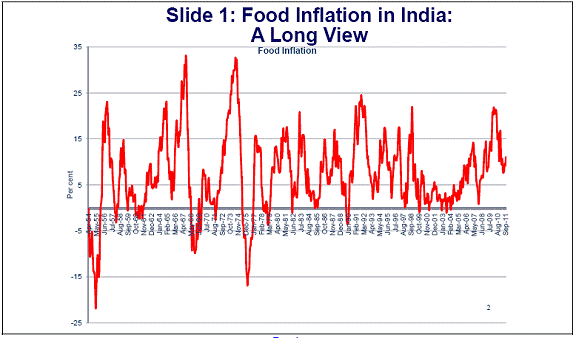
1 Carmen M. Reinhart & Kenneth S. Rogoff, 2008. "This Time is Different: A Panoramic View of Eight Centuries of Financial Crises," NBER Working Papers 13882, National Bureau of Economic Research. 2 Micro-level price dynamics of the major dietary sources of protein in India, based on demand-supply fundamentals is discussed in Subir Gokarn (2011), “The price of protein,” Macroeconomics and Finance in Emerging Market Economies, Volume 4, Issue 2. |
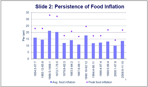
పేజీ చివరిగా అప్డేట్ చేయబడిన తేదీ:


